Tuesday, December 30, 2014
Puerto Rico Movie Test
I don't really know what I'm doing when it comes to posting movies on the internet, but lets give this a try. Shot outside my room in San Juan one early morning.
Sunday, December 28, 2014
Back From Vacation....
...Hard at work on the photos of the trip, and hoping to get a few sketch book pages up on the blog soon also. In the meantime, one panorama from the rain forest, El Yunque, in Puerto Rico. Michelle took me on hike to the river and we swam/hiked from pool to pool. Other than the four family dogs, we had the place to ourselves. Remarkable, and a very special afternoon.

Friday, December 12, 2014
New Black and White Panels
I continue to make black and white grid drawings like these in my sketchbook. But the thought this week was to get a few of the variations onto 12 x 12 panels. These three are the results thus far. I have plenty of panels on hand and hope to make one a day until the Holiday Break. I will be on vacation from December 18 until December 25. Do not stop by the gallery/studio, it will be closed. Have a great Holiday.
 |
| Three Untitled Panels - Acrylic Paint on Prepared Panel - 12 x 12 .75 inches each |
 |
| Detail |
Monday, December 1, 2014
Gridded Galaxy
Another vintage Michael McGuire drawing. Although I make variations on this theme still, the galaxy imagery from 2008/2009 is mostly gone. It was fun to come across this watercolor from 2008, a modification of the watercolor and rubbing alcohol process I occasionally use. This time I gridded out the points where the rubbing alcohol would be applied, and then worked my way out in a spiral using a mixture of blues in watercolor.
 |
| Gridded Galaxy - Watercolor on Fabriano Watercolor Paper - 22 x 30 inches |
Tuesday, November 25, 2014
More Sketchbook Work
I make drawings while riding the train. Specifically on my rides home from Wilmette after a dinner with my friends the Soskins, where most likely I have had a cocktail or three, and a large dinner. The train ride is long by some standards, up to an hour with a change of trains at one point. So I have come up with this series of drawings to make use of the time on the train. They are just a record of the date and time in bubble-like letters that I then crosshatch in a background for the duration of the train ride. I begin at the Linden station and put my pen away a minute before I reach the Addison stop near my home. The level of finish in the drawing it totally determined by the length of the train ride. I give up a lot but not all control, (I can still estimate how much time remains before my stop), but the results can be surprising, and I have a rudimentary diary entry.
On this particular night I was reassessing the guidelines for this series of drawings, hence the notes on the page above the drawing - I will try to explain and expand:

 |
| Sketchbook Entry - Sunday, November 23, 2014 |
- something to do on the train - I have this feeling lately in my life that I'm running out of time. There is much work to do and time is running short. This exercise is about making use of the time I spend riding the train. Some people read, some sleep, I feel compelled to draw, something I do not do enough of, and you have a small memento when you arrive at your destination.
- 2 Parts - a) the outline b) the coloring in - These drawings are a two step process. I make the outlines of the letters and numbers quickly, often as the train is sitting at the Linden station, the starting point for the Purple Line, before it starts it journey. I just get the information down, the day of the week, the date, and then I can spend the remainder of the train ride crosshatching, a mindless, yet to me comforting activity. This work eases all sorts of guilt about wasting time and not working enough as an artist.
- Time - Fast/Slow - Being busy with this activity can make the time spent on the train fly by - the sixty minutes feel like fifteen. I have occasionally wished I had more time on the train to get further through a drawing!!!! Time is malleable, I experience it on the train!
- Work on Tight Areas When Stopped - The train is mostly in motion. It rocks, it jerks, it starts and stops. Those movements make drawing a challenge in terms of neatness and technique. So I consciously work on the tighter, smaller areas while the train is stopped or slowed. When the train is moving quickly I cross hatch in the broader areas.
- Only the Duration of the Train Ride - Explained above but let me repeat, the drawing can only take the length of the train ride. I don't have to decide when the drawing is finished, the Chicago Transit Authority does it for me.
- Design Quickly If At All - This was the revelation of this most recent drawing. I have been doing this all along but I realized that not over thinking the layout and composition, not really controlling the font, will open this series of drawings up to unplanned, informal and less controlled results.
- Grown-up Coloring - This practice is no different than what I was taught to do in coloring books as a child, except no color and I make the outlines. Sometimes it is shocking how little my art practice has evolved in fifty years.
- Follow the Initial Outline - I was repeating myself on this one. Make the initial letters and numbers quickly, do not over think. Then live with what you made.
- Some Choices Base on Practicality and Utility - What I refer to here is that sometimes I will crosshatch in areas that are easy to get at, or feel good in regard the way I am holding the pen. Balancing the sketchbook on my lap on the train can be a challenge and some decisions are based on making the work not too difficult or painful.
On this night three young men got on the train at one of the stops that service Northwestern University. The train car was mostly empty but sometimes one chooses the closest seats and the they ended up surrounding me a bit. We started a conversaion and they were curious enough to ask about my scribbling in my sketchbook. I explained as best I could but I was unclear and self conscience. I did show them the few other pages that had been completed in the sketchbook, but they seemed unimpressed. I ended up explaining to them that I occasionally take photos on the train and would they let me take a panoramic photo that included the three of them. This explanation went on even longer than the sketchbook discourse and it involved me giving them my business card and asking to exchange e-mail addresses. Finally one of them said slightly exasperated, "It's ok, we give your our permission!" From what I understand they were heading downtown to do Karaoke. Good for them for venturing out via public transportation on a cold and wet Sunday night to experience Chicago.
Sunday, November 16, 2014
Sketchbook Pages
I have been working in a sketchbook lately, a return to a practice that I have pursued on and off for decades, and one that I find rewarding on a number of fronts. My intention is always to keep the book whole, to retain the book as a record of my own work as it evolves. I have quite a collection of sketchbooks, one that goes as far back as my senior year in high school where the practice was established by my art teacher Mrs Fields (not of the cookie fame). But keeping them intact does not always happen. This week I was persuaded to remove a few pages from my current book to make a sale - the mortgage is due. I'm very cautious as I razor blade out the pages, a viewer might not even notice that the book is not whole, but I still feel a bit guilty. This new series in the book feels fresh and intriguing, and the response has been positive. So it seems a good idea to upload this photo of ten of the pages before I'm tempted to remove any more.
 |
| Various Sketchbook Pages - Moleskine Watercolor Sketchbook, each page 16 x 12 inches |
Wednesday, November 12, 2014
Some Old Drawings....
....Unearthed as I continue to resettle my apartment after new windows and a paint job. Found them all in a rather distressed cardboard box - many circa 2008/2009. Quickly photographed on the floor of the studio, note the yardstick for scale.


Thursday, November 6, 2014
Two New Indigo Drawings
I continue to make drawings on Indigo backgrounds. I'm trying to take advantage of the last few temperate fall days we have in Chicago to dye a quantity of Arches watercolor paper. It is a messy process, I do it outside in our back courtyard, and I'm feeling productive if I get two sheets of paper colored to my satisfaction in one day. I like the series, I visit familiar motifs but the blue makes them feel fresh. At the same time I continue to look at the early Frank Stella paintings as a source of inquiry.
 |
| Untitled (Indigo Stella Study) - Watercolor, Acrylic Paint Pen, Arches - 40x26 inches |
 |
| Untitled - Watercolor, Acrylic Paint Pen, Arches Watercolor Paper - 40x26 inches |
Monday, November 3, 2014

Wednesday, October 29, 2014
Fall - The Climbing Vines Change Color

I'm making photographs of the climbing vines again. Now that fall is in full swing and the colors are changing here in Chicago, the vines are taking on significant color. These vine flourish all over the city, but are often lushest in places where they are mostly neglected. Settings like parking lots and alleys where these plants are left unattended are where they grow best in the urban environment. I shoot them head-on, flattening the composition to landscape like configuration. There is something in them that remind me of the sensibility of Asian folding screens, paintings and scrolls.
Tuesday, October 28, 2014
New Drawing and a Few Variations
I made another drawing with a skewed grid of 'galaxies' as the subject matter. I place the grid in rudimentary two point perspective to give it a sense of depth and movement. A drawing like this is a perfect candidate for my 'Squaring the Square' thesis. When you take a subject that is largely squarish or rectangular, and in Photoshop, correct it using their grids as a guide to what is truly square on the computer screen, and leave the original edges of the image, you get an interesting artifact of the original that depicts the distortions along the edges. I'm not explaining it particularly well, but below are three photos that illustrate the process. The first photo is the original drawing, watercolor and acrylic paint on Arches watercolor paper, shot on the sidewalk in front of the gallery with four glass weights to hold the corners. A simple description would be a distorted rectangular grid of 'galaxies' connected by thin white lines. The second image is the same subject matter after I have 'corrected' the white grid in the original to make it square. This is a simple Photoshop step using the Distort, Skew and/or Perspective manipulations. I let the edges expand or contract as needed. And the third image depicts further manipulation of the image by bringing the original grid back to a somewhat rectangular configuration. When I look at that third image I get a sense of falling into the drawing, the sensation that the white grid of the drawing and the edges of the paper exist in different planes if pronounced. NOTE: The change in the four corner weights, which in reality are the same size, as they mutate through each step.


 |
| Untitled - Watercolor, Acrylic Paint, Arches Watercolor Paper - 40 x 26 inches |
Sunday, October 26, 2014
Recent Commission and One Happy Accident
I had a commission this week, fairly straight forward, but labor intensive. The two drawings are from my 'Second City' series and I would describe them as abstracted notions around buildings and perspective drawing.
For drawings of this sort I make fairly precise preliminary underdrawings in #6 pencil as a guide for the later aplication of acrylic paint. The pencil drawing always takes more time than the painting itself. It is a juncture when everything is measured and made just right in terms of position and composition. Once the pencil is competed the remainder of the work is more about the process and focus. During the course of this commission I did make a mistake. The pencil drawing was finished, but about five minutes into the painting portion, I lost my concentration and let the paint pen slip. The result was a wayward line that could not be repaired or covered. I had to start from the beginning. Once I had finished the two drawing for the commission I returned to the 'mistake'. I covered the slipped pen mark with a wider line, and then proceeded to fill the entire page with the grid-like intersecting planes. The result is like an illustration out of a algebra book. I cannot decide which way is up - Both orientations present a unique reading - planes recede, edges move forward. I quickly made a few shadow studies in Photoshop. I'm not sure they help define the space in the drawing, and that is not really the point, I consider these drawings abstractions. A fun exploration and a lesson about making use of missteps.
 |
| Second City 6, Second City 7 - Acrylic Paint, Pencil, Arches Watercolor Paper - 40 x 26 inches each |
For drawings of this sort I make fairly precise preliminary underdrawings in #6 pencil as a guide for the later aplication of acrylic paint. The pencil drawing always takes more time than the painting itself. It is a juncture when everything is measured and made just right in terms of position and composition. Once the pencil is competed the remainder of the work is more about the process and focus. During the course of this commission I did make a mistake. The pencil drawing was finished, but about five minutes into the painting portion, I lost my concentration and let the paint pen slip. The result was a wayward line that could not be repaired or covered. I had to start from the beginning. Once I had finished the two drawing for the commission I returned to the 'mistake'. I covered the slipped pen mark with a wider line, and then proceeded to fill the entire page with the grid-like intersecting planes. The result is like an illustration out of a algebra book. I cannot decide which way is up - Both orientations present a unique reading - planes recede, edges move forward. I quickly made a few shadow studies in Photoshop. I'm not sure they help define the space in the drawing, and that is not really the point, I consider these drawings abstractions. A fun exploration and a lesson about making use of missteps.
 |
| Untitled - Acrylic Paint, Pencil, Arches Watercolor Paper - 40 x 26 inches |
 |
| Same Drawing Rotated 180 Degrees |
 |
| Misc. Computer Shadow Studies |
Sunday, October 19, 2014
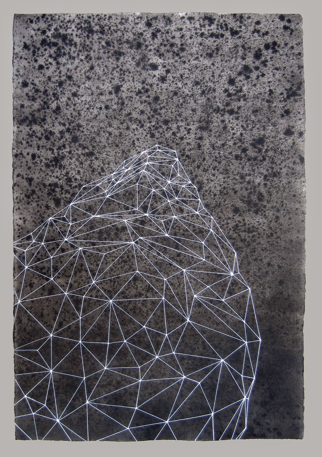
New Drawings - October 19, 2014
This week I had some time to draw on two of the sheets of Arches watercolor paper I had previously stained with India ink and Windsor Newton watercolor. I'm experimenting a bit with a strategic use of color, and I continue the exploration of Delaunay triangles and how they can define a sense of space and structure.
 |
| Oort Object 3 - India Ink, Watercolor, Acrylic Paint Pen, Arches Watercolor Paper - 40" x 26" |
 |
| Red Bundled 2 - India ink, Acrylic Paint Pen, Arches Watercolor Paper - 40" x 26" |
Sunday, October 12, 2014
Homage to Frank Stella
I have always felt an affinity to the early Frank Stella 'Black' paintings. The geometry in them relates to many things I think about and create. I finally broke down and am making a few drawings that directly quote him.
 |
| Untitled (Stella Study) - Indian Ink, Acrylic Paint Pen, Arches Watercolor Paper, 26 x 41 inches |
Thursday, October 9, 2014
Andersonville Arts Weekend
The Opening Night Reception is Friday, October 10, 2014 - from 6 to 9pm. I will be hanging out at Scout on Friday and will be showing four beautifully framed drawings from my latest body of work there.
I will also have unframed work at Las Manos Gallery. Michelle Peterson Albandoz and Tricia Rumbolz will also be showing new work. Stop by both places if you get a chance, it will be a fun night.

 |
| Untitled - India Ink, Acrylic Paint, Arches Watercolor Paper, 40 x 26 inches |
I will also have unframed work at Las Manos Gallery. Michelle Peterson Albandoz and Tricia Rumbolz will also be showing new work. Stop by both places if you get a chance, it will be a fun night.
Monday, October 6, 2014
New Drawing
 |
| Michael McGuire - Untitled - India Ink, Acrylic Paint, Arches Watercolor Paper - 40 x 26 inches |
Saturday, September 27, 2014
Close Encounters With A New Drawing
 |
| Untitled - Windson Newton Watercolor, Acrylic Paint Pen, Arches Watercolor Paper - 26" x 40 " |
This new drawing has been knocking around the studio for a few weeks. Many people seem to like it and ask about it's precedents, which are many. Architectural drawing, and specifically perspective drawing figures into its making. The slight skewed grid was created using an old standby for perspective drawing - by definition the diagonal lines connecting the nodes should all 'vanish' to one point on a distant horizon. I use this rule to help me establish a simple grid on the paper.

Additionally a few years ago I made a series of drawings using watercolor paint and rubbing alcohol, which when applied on top of the freshly wet watercolor, expands and resists the color. Which to me looked very much like galaxies and stars.
But quite frankly, the biggest influence of all, certainly the one that reaches back the furthest for me, would be the movie 'Close Encounters of the Third Kind', the Steven Spielberg movie from 1977. I know I sat though it twice the first time I saw it. But what very much impressed me about the movie at the time was the simple and elegant way the makers used light to create the illusion of something real and three dimensional. The early scenes of the initial encounters with the smaller UFOs were thrilling for me and I like to occasionally think of a drawing like this as an alien space craft or at least the stars aligning in some unreal way.


Sunday, September 21, 2014
'Bundled' Drawings
A new series of drawings is emerging from my recent stint of work. I call them 'Bundled' because they resemble things that are wrapped or bound together. They are abstract and can be read a variety of ways, but the bundled idea is what I see first. Pictured is my most recent drawing, and then three of the earliest drawings where the under-color did not cover the entire page. The surface of the drawing below is mottled India ink and the acrylic pen is silver in color.

 |
| Bundled 5 - India Ink, Acrylic Paint on Arches Watercolor Paper - 40 x 26 inches |
Thursday, September 4, 2014
Mark Mulhern - Tory Folliard Gallery Milwaukee
One of my favorite artists, Mark Mulhern, has show of his work opening soon in Milwaukee. Tory Folliard Gallery, in the historic third ward of Milwaukee, will be holding an opening reception for Mark on Friday September 12 from 5 to 7:30pm. Mark is a life long painter and print-maker and I have found his work beautiful and profound for years. His long term commitment to painting shows itself in large paintings that are skillful, quirky and gorgeously colored. The paintings and prints straddle both representation and abstraction simultaneously. His new work continues his exploration of some of his favorite themes, domesticity, household objects, and public spaces filled with people. The photos below of photos of some of his newest work. Try to make the show if you can.
 |
| Mark Mulhern - Brocante - Oil on Canvas - 70" x 80' |
 |
| Mark Mulhern - Love Seat - Oil on Canvas - 48" x 60" |
 |
| Mark Mulhern - Flea Market - Oil on Canvas - 50" x 60" |
Saturday, August 30, 2014
New York Times Article You Should Read
Nice article in the New York Times laying out a few of the factors that define the 'Millennials'. Some interesting ideas within the article.
http://www.nytimes.com/2014/08/17/fashion/the-millennials-are-generation-nice.html?_r=0
http://www.nytimes.com/2014/08/17/fashion/the-millennials-are-generation-nice.html?_r=0
Thursday, August 28, 2014
A Drawing From The Show At Las Manos Gallery
 |
| Untitled - Watercolor, Cardboard, Acrylic Paint, Watercolor Paper - 40"x26" |
I begin by washing good Arches watercolor paper with very concentrated 'Windsor Newton' Indigo watercolor. When the color is dense the blues look black/violet from some angles. The color never goes on completely evenly, and I don't really strive for that, the variations indicate traces of the handmade, and it can suggest any number of landscape elements. Once the paper is dry I flatten it by piling on heavy books overnight. The next morning the paper is flat-ish and I begin gluing on the triangular white cardboard pieces that have been washed in varying degrees with white acrylic paint. I diminish their size as I work my way up the sheet of paper, attempting to create a sense of perspective and receding space. I did forget how difficult it is to glue down the smaller triangles. My glue covered fingers just are not dexterous enough to easily manage small pieces of cardboard neatly. And every piece needs to be held in position for the first few minutes of dry time. Three days later I was finishing up the top row of tiny white triangles, and very ready to move on.
Monday, August 25, 2014
A Few Photos From Last Fridays Reception At Las Manos
 |
| Ted Harris, Michelle Peterson Albandoz and Myself in front the wall of my drawings. |
 |
| The front entry of Las Manos Gallery. |
 |
| The view from Foster Avenue with Ted Harris Lamps in window. |
 |
| A collaboration between Ted Harris and Myself. |
Sunday, August 17, 2014
New Show, New Work
My concept for the show with Ted Harris that opens this coming Friday at Las Manos Gallery is various works on Arches 26 x 40 inch watercolor paper. As you might know if you have check in on this blog recently I have been dying, staining and/or adding watercolor washes to the paper for a few weeks now. On top of that I have been drawing, with acrylic paint pens, imagery derived from my architectural drawing past. I hope to have at least a dozen of these drawings and although they will not be framed, I'm going to make some sort of installation out of them on the plywood walls.
The opening reception is on Friday August 22, 2014 at Las Manos Gallery, 1515 W. Foster Ave in Chicago. The party will run from 7 until 10 pm. It should be a good one!
Ted Harris has been hard at work in his studio creating lamps to fit the scale and sensibility of Las Manos.
Nicole Hollander is creating what I can only call dioramas with fish!
Kathryn Trumbull Fimreite will be showing a beautiful DVD about the frustrations of creative endeavors.
Michelle Peterson Albandoz promises on new large 'circular' piece, and Tricia Rubolz is always hard at work.
 |
| Untitled (Grid on Grid 1) - Watercolor, Acrylic Paint, Watercolor Paper - 26 x 40 inches |
The opening reception is on Friday August 22, 2014 at Las Manos Gallery, 1515 W. Foster Ave in Chicago. The party will run from 7 until 10 pm. It should be a good one!
Ted Harris has been hard at work in his studio creating lamps to fit the scale and sensibility of Las Manos.
Nicole Hollander is creating what I can only call dioramas with fish!
Kathryn Trumbull Fimreite will be showing a beautiful DVD about the frustrations of creative endeavors.
Michelle Peterson Albandoz promises on new large 'circular' piece, and Tricia Rubolz is always hard at work.
Thursday, August 7, 2014
Guess What, I'm In The Next Show At Las Manos!
The new show will also feature Ted Harris. He had been designing new lamps fitted to the scale and sensibility of Las Manos Gallery. I continue to hand dye Arches watercolor paper and then draw architecturally inspired images over them. Also included in this next show will be Nicole Hollander showing small dioramas with live fish, and a few hand embellished drawings! And Kathryn Trumbull Fimreite will show a beautiful video that concisely sums up the art-making experience. Michelle and Tricia promise new work too.
The show will open on August 22, 2014, and the reception will run from 7 to 10pm on that day. Hope you can make it.
 |
| Back Courtyard Las Manos Gallery - Michelle Peterson Albadoz, Wood Rings - Ted Harris, Indigo Lamp - Michael McGuire, Cubed Tower |
Tuesday, August 5, 2014
New Collage - White Paint on Cardboard
 |
| White Collage Study - Acrylic Paint on Recycled Cardboard - 12 x 24 inches |
Wednesday, July 30, 2014
Out Of That Corner - Two New Drawings
I continue to work at coloring (staining) my Arches watercolor paper. Some of them are amazing, but I am drawing 'architecturally' on top of them. Something about the 'rational' holding back the chaos. The tower is based on the cubing of the first thirteen positive integers, what is more rational than that?
 |
| Tower of Cubes - Arches Watercolor Paper, India Ink, Acrylic Paint - 40 x 22 inches |
 |
| Untitled - Arches Watercolor Paper, India Ink, Acrylic Paint - 40 x 22 inches |
Sunday, July 20, 2014
Drew Myself Into a Corner
 |
| Michael McGuire - Untitled - Acrylic Paint on India Ink on Watercolor Paper - 40 x 36 inches |

Subscribe to:
Posts (Atom)